What are the 2024 colors of the year and why it matters
LOS ANGELES - Companies are beginning to unveil their 2024 colors of the year, prompting lust for rediscovered tones and swooning over underrated shades.
According to Better Homes & Gardens, trend experts say earthy, nature-inspired tones are what many consumers will gravitate towards beginning next year.
While Pantone is the big player in the color-of-the year selection, they won’t release their selection until December. But many paint and interior design companies have begun releasing their colors of the year to the public already.
LIST: You can view the complete list of colors so far at the end of this article.
Before getting into it, though, there is something that should be noted regarding the trickle-down effect that these annual color announcements have, not only on consumer trends, but also on the overall cultural zeitgeist.
There’s more to color than meets the eye.
The summer of pink
You may have noticed this past summer, pink was everywhere – from the release of the "Barbie" movie to the hype around Miami FC’s pink jersey following the entrance of soccer legend Lionel Messi to the MLS.
The color pink has been a crucial detail for films and television – from that scene in "Funny Face," to Elle Woods sporting her iconic head-to-toe vibrant pink courtroom outfit in 2001’s "Legally Blonde," to "The Marvelous Mrs. Maisel," where the shades of pink in costuming play a symbolic role in the final season. And, now, with the Greta Gerwig-helmed film’s release, the vividly hot "Barbie Pink" quickly became inescapable.
RELATED: "Barbie" movie needed so much pink paint, it caused an international shortage
For sale: Regular Michigan condo on outside, Barbie-inspired condo on inside
The condo, located in Ann Arbor, spans over 1,200 square feet and is adorned with pink accents throughout the property. It's described on the property listing as a "Barbie Dream Condo." (Credit: Moving The Mitten Real Estate Group, Windowstill Photography)
Throughout history, designers, artists, and brands have played with the emotions the color evokes, shaping meanings that are ever-evolving. From gender to class, those associations have constantly been challenged, flipping and subverted – while the definition of pink is always in flux, there’s one constant: its cultural staying power.
The meanings behind the many shades of pink
Pink first became fashionable in the 18th Century in the French court, because of a new source of dye that imparted a more vivid, long-lasting color in fabrics, explained Valerie Steele, director of The Museum at FIT and one of the authors of "Pink: The History of a Punk, Pretty, Powerful Color."
Since then, the cachet of pink has ebbed and flowed; as pink dyes became more accessible to the working class, the color lost its association with wealth and prestige.
When first popularized, it was worn by men and women alike, but in the 1920s, U.S. department stores claimed blue for boys and pink for girls.
"It was really totally arbitrary," Steele said of the correlation.
Fast forward a few generations to 2016, when Pantone chose "Rose Quartz" as a color of the year: The muted dusty pink is calming but also connotes strength, said Laurie Pressman, vice president of the Pantone Color Institute. She told The Associated Press one of the reasons for the pick was the rise of the "gender blur." (The color was quickly embraced by fashion and interior designers, earning the moniker of "millennial pink.")
That symbiotic influence — pink providing texture to and receiving a boost from a cultural force — was evident the next year at the Women’s March on Washington, where demonstrators donned loudly pink "pussy hats."
The psychology of color
We’re drawn to colors because they instantly convey various emotions, explained David Loranger, a professor of fashion merchandising and marketing at Sacred Heart University.
"I feel like having a direct line to the senses from a marketing standpoint is so important because it’s a nonverbal, it’s a semiotic vehicle," Loranger said. "The best marketing is very deeply rooted in emotion."
But from where do those innate emotional connections stem? It could come from something in nature, a belief system or something we’ve been told.
"Every color has meaning that we almost inherently sense from that color, whether we’ve learned about it by association or just conditioning, which helps us to intuitively understand the message and the meaning that’s delivered," Pressman said.
When it comes to consumer marketing, the wide variance in pink’s meanings means everyone can get in on the action. From high fashion — Valentino collaborated with Pantone and created a collection out of the resulting custom shade, shown on a pink runway last March — to everyday items, pink abounds.
Beyond the pale…shades of pink
Acclaimed film colorist Stephen Nakamura and Senior Colorist at Company 3, is responsible for films with arguably the most memorable uses of color in the history of the medium.
Nakamura’s prolific career credits include "Fight Club," "It: Chapter Two," "Crazy Rich Asians," and essentially every Ridley Scott film that was finished digitally, including the upcoming and highly anticipated "Napoleon" epic.
Speaking with FOX TV Stations, Nakamura gave insight into what color means for a film and how the impact of choosing those colors can have ripple effects to the viewers and beyond.
Of course, during the interview, Nakamura noted that he mostly wears black.
"It’s really about evoking the emotions that you need," Nakamura explained.
"If you were to go to a place that’s really cold and dark but you’re having a romantic scene somewhere chances are I’m probably not going to make it colder. It really has to do with the scene, it really has to do with the story."
As Nakamura explains, despite two lovers convening in a cold and arid setting in a film, the specific alteration of color can change the context so that the strength of the story can survive in such an unlikely climate, and many experts believe this is why color is so meaningful.
Whether the Democrat wears the blue tie or the Republican, the red tie, the use of color can completely shape a person’s perception despite the environment or absolute truth unfolding on a macro level.
Apple computers explained it plainly in a blog post published in Sept. 2023.
"Judicious use of color can enhance communication, evoke your brand, provide visual continuity, communicate status and feedback, and help people understand information."
List: 2024 colors of the year
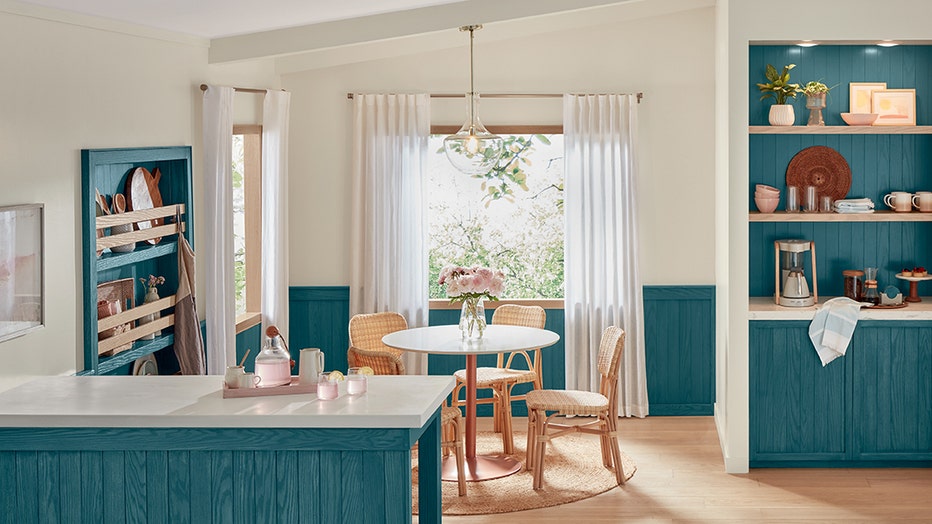
Minwax: Bay Blue

Minwax introduces its color of the year
"Bay Blue is at the intersection of contemporary and classic," said Sue Kim, director of color marketing for Minwax, in a press release. "This year’s color is meant to ignite the creativity of DIYers to think of bold and rich color stain options when planning their next home project. With Bay Blue available in both solid and semi-transparent wood stain opacities, the possibility to create custom looks is easily within reach."
Glidden: Limitless
"This modern neutral is as adaptable as its name implies and is taking the place of cool neutral tones that are so last year," said Ashley McCollum, color expert for Glidden, in a press release.
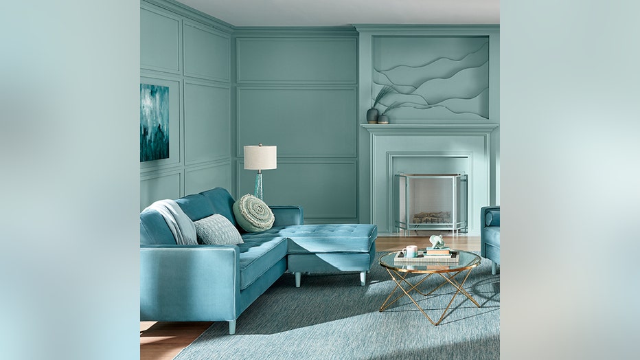
Valspar: Renew Blue

Valspar color of the year.
"Renew Blue is an incredibly versatile and all-season shade that anyone can envision in their space. Inspired by fleeting elements like fog, mist, clouds, and glacier lakes, Renew Blue elevates the everyday mood, encourages self-expression, and evokes a feeling of balance and calm, with a twist of unique spontaneity," said Sue Kim, Valspar director of color marketing, in a press release.
Behr: Cracked Pepper
"A versatile soft black that accentuates the spaces you create life moments in," Behr said in a press release.
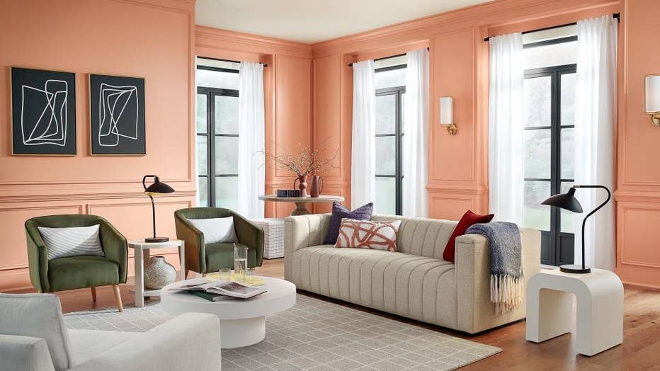
HGTV Home by Sherwin-Williams: Persimmon

Photo By: HGTV Home by Sherwin-Williams
"Persimmon balances the energy of tangerine with grounded neutral undertones, making it perfect for spaces like living rooms and kitchens as it promotes positive relationships and conversation," said Ashley Banbury, Sherwin-Williams' color marketing manager, in a press release. "The beautiful shade helps rejuvenate a space while bringing unique design visions to life."
Dutch Boy: Ironside
"We're taking a comforting approach; embracing restoration and nature, while bringing harmony into the home," said Dutch Boy's senior brand manager Michelle Bangs in a press release.
The Associated Press contributed to this story.

