

‘Warming stripes’ graphics updated for 2025: See your city's

UN report finds further warming 'locked in' on climate change
The Intergovernmental Panel on Climate Change said in the August 2021 report that humans have unequivocally contributed a great amount to the crisis.
Ahead of "Show Your Stripes Day," a day dedicated to spreading awareness about climate change, Climate Central released their annual striped graphics showing temperature trends over the last 100 years.
The data, which used data by the National Oceanic and Atmospheric Administration (NOAA), is based on annual average temperature anomalies for 49 states and 195 cities in the U.S.
‘Warming stripes’ reveal that planet continues to warm
The global warming stripes, created by Professor Ed Hawkins, are a visual representation of the long-term rise in global temperatures due to human-caused climate change.
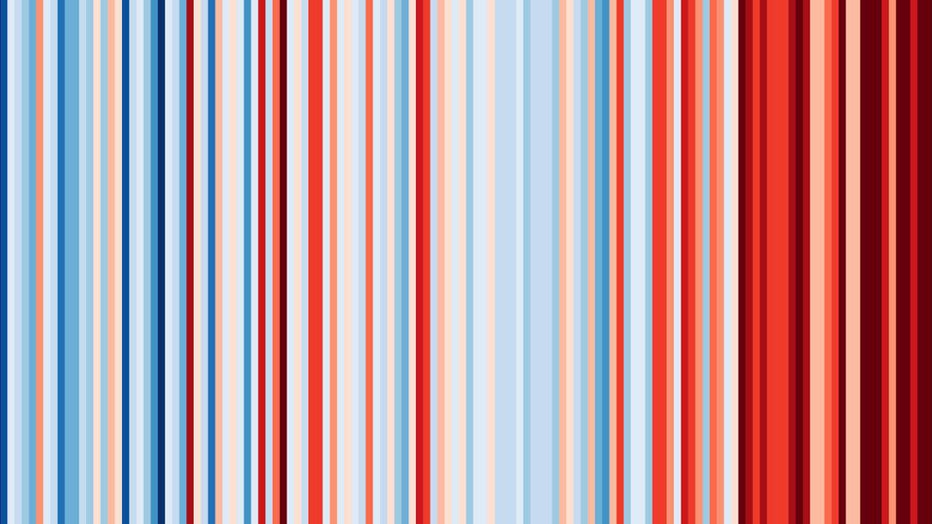
U.S. warming stripes through 2024. (Credit: Climate Central)
On the graphic, each stripe represents the global temperature averaged over one year, from 1850 to 2024. Red stripes are years that were hotter than the 1961-2010 average; blue stripes are years that were cooler.
According to Climate Central, the strong red shift reflects rapid warming in recent decades.
Fastest-warming city in Arizona
Most locations showed a strong warming trend, especially in fast-warming regions like the Southwest, Northeast, and Alaska.
By the numbers:
In 2024, the following cities were the warmest relative to the 20th century average: Phoenix, Ariz. (7.0°F above average); Fargo, N.D. (6.6°F); Burlington, Vt. (6.4°); and Reno, Nev. (6.2°F).
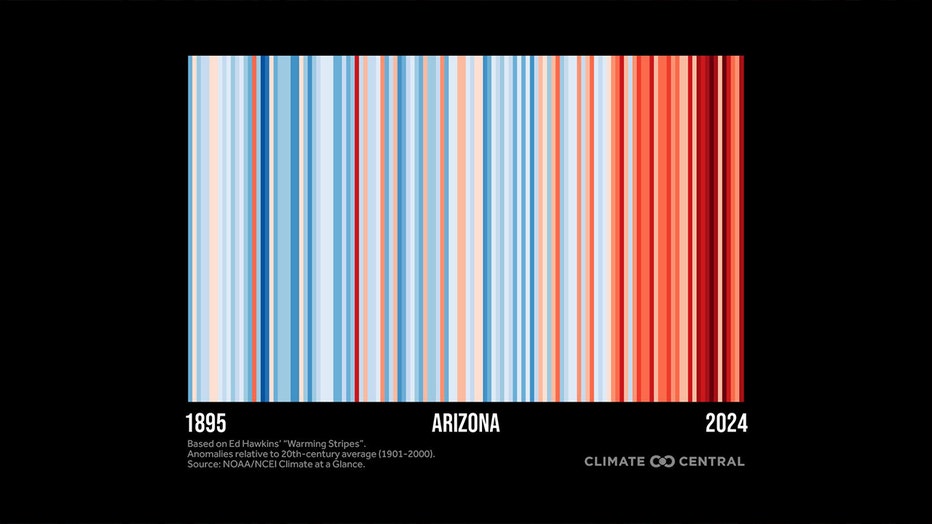
Arizona's warming stripes through 2024. (Credit: Climate Central)
What they're saying:
"Global temperatures shattered records in 2023 and 2024 by such wide margins that it’s forcing an expansion of the warming stripes color scale earlier than expected," Climate Central said. "These recent record-breaking global temperatures — both on the land and in the ocean — have pushed the planet even closer to the internationally-agreed goal to limit warming to 1.5°C (2.7°F) or well below 2°C (3.6°C) above pre-industrial levels. "
RELATED: Here's how much stronger climate change has made hurricanes
Exceeding 1.5°C in a single year, which first occurred in 2024, does not mean that the 1.5°C limit set by the Paris Agreement as breached. However, Climate Central said that the limit, which represents a long-term global temperature anomaly averaged over at least 20 years, will be reached in the early 2030s if current rates of warming continue.
According to NOAA, warming beyond this threshold will result in increasingly frequent and intense extreme weather events, and increasingly disruptive impacts on health, nature, crops, and economies around the globe.
‘Show Your Stripes Day’ on June 21
The backstory:
June 21 is Show Your Stripes Day and coincides with the summer solstice.
The global campaign is dedicated to spreading awareness about climate change using the iconic "warming stripes" graphics showing temperature trends over the last 100+ years.
This iconic climate data visualization will appear on landmarks, sports jerseys, cars, and more as the world unites to show their stripes on June 21.
People can visit showyourstripes.info/map to find warming stripes for hundreds of cities across the globe.
The Source: Data for the global warming stripes graphic (1850-2024) is from the UK Met Office; the graphic was accessed directly from showyourstripes.info, courtesy of Ed Hawkins, National Centre for Atmospheric Science, University of Reading. Data for stripes graphics for the contiguous U.S., and U.S. states are from NOAA’s NCEI Climate at a Glance. Data for U.S. cities are based on weather station data from the Applied Climate Information System, which is developed, maintained, and operated by NOAA’s Regional Climate Centers. This story was reported from Los Angeles.